Cloud Services lets you build and deploy highly-available, infintely-scalable applications and APIs. It lets you focus on building the application itself without having to worry about the hardware, OS updates, network issues, etc. You can test your changes before going live by first deploying them to the staging slot. You can read more about it's features here: Azure Cloud Services. So, lets talk a bit about how to create them using the Azure Portal and then how to manage them.
In this post, I'd like to talk about and highlight some of the improvements we've been working on the past month. Among other things, we've made a few tweaks to the create flow, and a bunch of usability improvements to manage and monitor the cloud service.
Creating a Cloud Service
You can start the create flow for one by hitting the + button at the top-left of the Azure Portal. This flow is already covered in the Azure documentation.
We've made an enhancement to this flow that lets you use package and configuration files that you've already uploaded to blob storage. You can get to the new UX by choosing "from blob" radio button.

The list of storage accounts you can choose from is filtered down to the subscription and location that you selected on the first blade of the flow. Once you've selected a storage account, you can find the container that contains your package and/or configuration files.
Each of the lists for accounts, containers and blobs has search enabled which can be pretty useful when you have a lot of them.
Managing your cloud Service
Move your service across subscriptions and RGs
You can now move your cloud service to a different resource group and/or subscription directly from the cloud services overview blade.

Switching which slot you manage
One aspect of the manage blade for a cloud service that caused it to be a bit tedious was the fact that every time you wanted to manage a different slot, you had to go back to the overview, switch the slot and get back to the view (e.g. configuration, scale, etc.) that you were on.
To improve usability you can now switch the slot you're managing from all relevant views/blades including Antimalware, Configuration, Roles and instances, Remote desktop, Scale, Properties, and Metrics.
Reducing horizontal scroll
One of the common complaints from users of the Azure Portal has been the amount of horizontal scrolling in various flows. With this release we've tried to reduce the amount of scrolling involved in managing a cloud service.
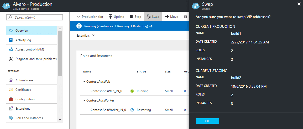
For example, the view to swap slots now shows up as a flyout from the right. That way, the main view is always on screen. As opposed to earlier where it would open as a blade to the right, making the main blade scroll out of view.

Similar improvements have been made for managing Antimalware for each role, and the role instances themselves.

Monitor your cloud service
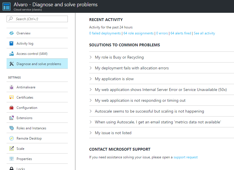
Diagnose and solve problems
This view has been available for a little bit now, I'd still like to highlight this since it is quite valuable when you're trying to figure out the cause of an issue.

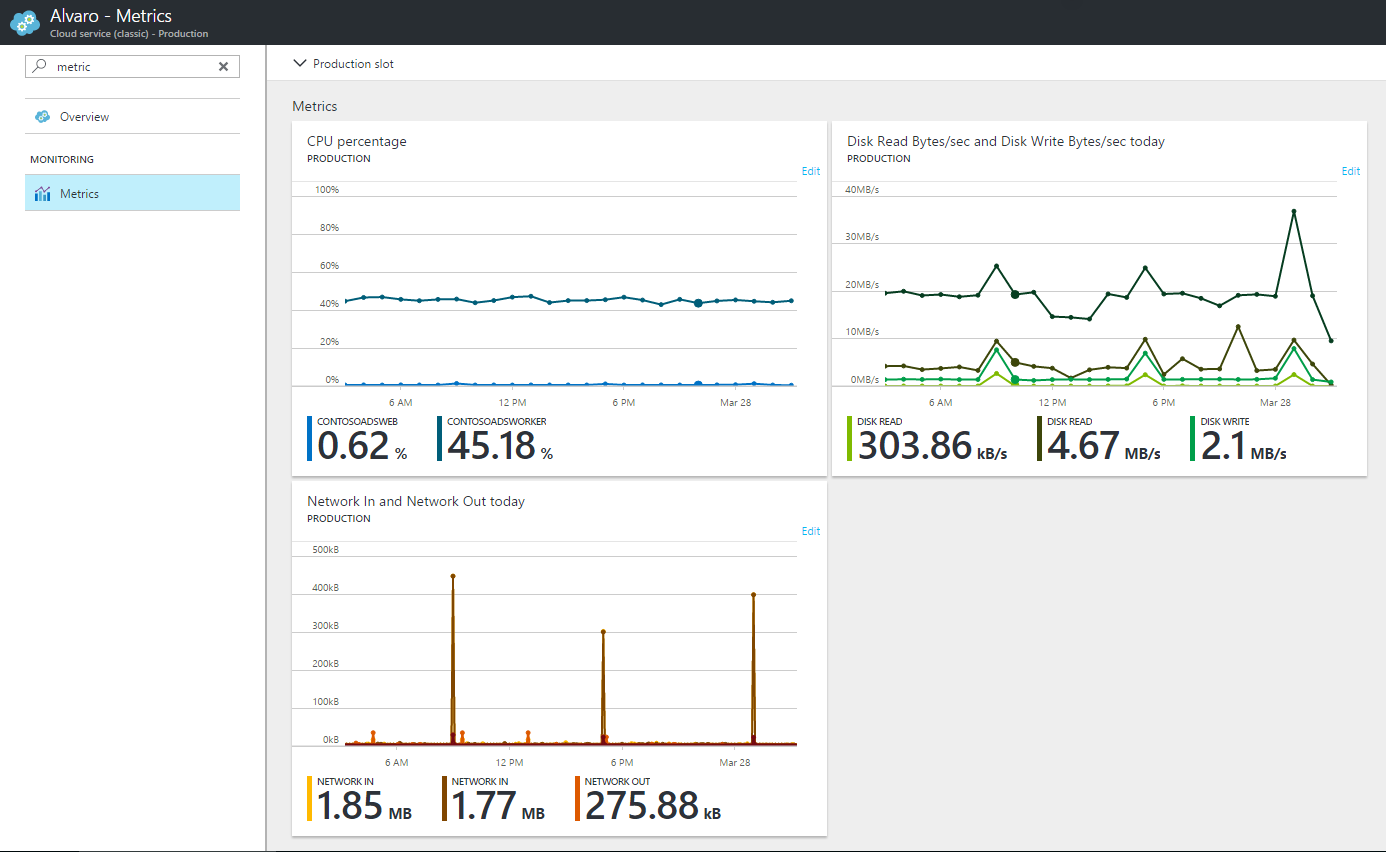
Metrics
To help monitor your cloud service, we now have a dedicated menu item which shows important metrics per slot showing CPU percentage, disk usage and network.

What next
We are working on a few more usability improvements in the Cloud Services UX, so stay tuned. If you have any feedback, please do post on the Azure Portal UserVoice.
In the meantime, here's some links that you may find useful: -
- Is Azure Cloud Services the choice for you? find out
- Common Cloud services management tasks: https://docs.microsoft.com/en-us/azure/cloud-services/cloud-services-how-to-manage-portal
- Other articles I've posted on Azure Portal: click here

