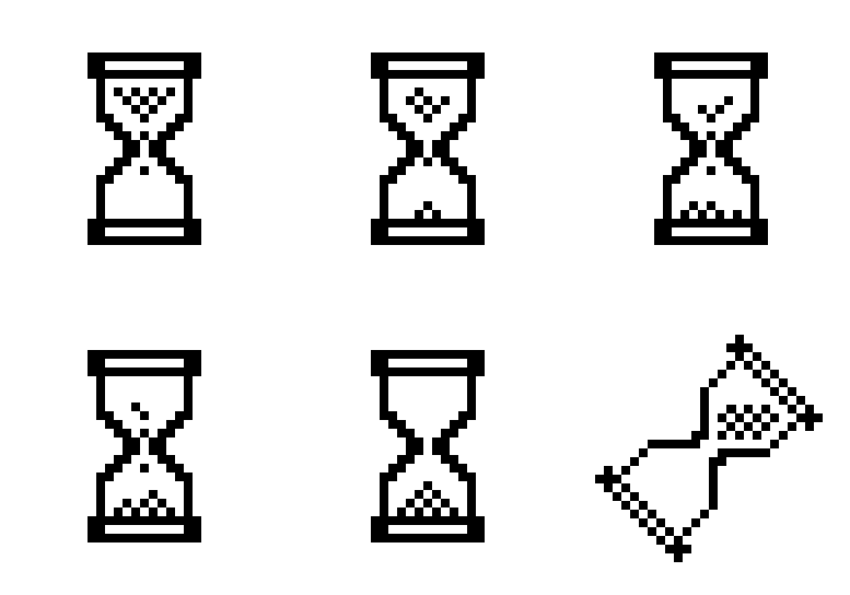
In an ideal world, file downloads or an application start would happen in the blink of an eye. So would website loads and rendering of information on views. However, in reality that's not usually the case; more often than not, there are delays. And when this happens for an acceptable experience, users should be given feedback to let them know that they need to wait a bit (or a lot as the case may be).
Scenarios
Here's a few common scenarios where you may want to display a loading indicator.
when waiting for a view to render
If it takes a while for a view to render, present users with a loading screen which provides feedback. Here's a sample loading indicator from the spinkit website.

Here's another example from the Azure Portal which takes it a step further. Initially, the indicator covers the entire UI component. As the UI renders to a semi-acceptable state, the shield is removed and an alternate indicator is displayed at the top of the view as the chart loads.

When performing long running operations
When an operation is likely to take a long time, it may be a good idea to give the user feedback on how it is going. Base on what we know about the operation, different types of progress indicators should be shown.
Determinate: If we know how long an operation is going to take, the recommendation would be provide feedback as the operation progesses e.g. showing the percentage of completion.

In such a case, you should be mindful that progress is accurately represented. e.g. if you reach 80% in 5 minutes and then take another 15 minutes for the remaining 20%, you can imagine how frustrating it would be for the user.
Indeterminate: Should be used when the duration of the operation is unknown. I'd recommend that you only use this type of indicator for shorter operations. If an operation is likely to take a long time, showing an indeterminate indicator will not be an ideal experience for the user.

Examples of loading indicators
Over the years, various kinds of indicators have been used to convey the message to users.
The hourglass cursor: For years, various products have displayed an animated hourglass cursor to indicate that an application is busy performing an operation. Most prominent among these was Windows, though since Vista the wait cursor has been changed to more of a circular animation shown below.


The splash screen: Splash screens are usually displayed when an application is opened and dismissed when loading is complete. It is a view that usually contains the product branding and some animation such as a progress bar or spinner.

The progress bar: Used to indicate the progress of an operation such as buffering, download or an installation, these come in several flavors. Typically, they consist of a bar that gets filled as the operation completes.
When to show the indicator
There's a few cases to consider. Lets take the simple cases first.
- If the operation is always fast: then perhaps you don't need a loading indicator.
- If the operation always takes a long time: in such a case, show the loading indicator immediately.
The scenario that is tricky is when you're not sure how long the operation is going to take. If you show the loading indicator immediately, and the operation completes soon, it will result in a UI flicker - which wouldn't be desirable.
A common scenario when this happens is operations whose results can be cached. Thus, there'll be cases when the operation completes really quickly and cases where it takes a long time. To avoid the UI flicker due to the indicator showing for a brief moment and disappearing, introduce a small delay after which the loading indicator is displayed. By doing this, if the operation completes quickly, the indicator is never shown. The time delay before showing the loading indicator should be tweaked based on your UI. I've found that in a lot of UX the optimal range lies between 1/2 to 2 second mark.
Choosing a good animation for an indeterminate loading indicator
I cannot claim to be an expert in UX design, and so I'll simply share a few link I found interesting.
- http://www.sitepoint.com/css3-ajax-loading-icon/ - talks about how to create your own loading indicator and how to animate it using keyframes.
- Spinkit - provides simple CSS- based loading spinners for Web UIs.
- https://dzone.com/articles/loading-animation-wpf - building a custom spinner in XAML/WPF
